CLIENT PROJECT · BRAND & WEBSITE
A flowering business.
Rooted in design.
Connecting an earthy, expressive identity to the products on the bag and the experience on the screen.
I worked across identity, packaging, Figma and WordPress to bring EarthMan’s Living Soil into one recognizable visual world.
- My role
- Freelance designer & developer
- Scope
- Identity · Labels · Interface · Website
- Design tools
- Illustrator · Figma
- Implementation
- WordPress · WPBakery · HTML/CSS/JS
01 / AN IDENTITY WITH CHARACTER
Earthy, recognizable and anything but generic.
The client’s starting direction was open: make the brand feel earthy and easy to recognize.
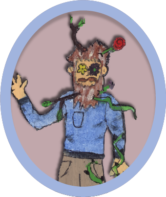
I reviewed organic-soil brands and their packaging, typography and visual language. In Illustrator, I developed an expressive wordmark and plant-based imagery that connected to the name without losing the playful character of the business.

A family of products, each with its own voice.
Color palettes and individual wordmarks distinguish the product variants while the shared identity holds them together. “Ka-bloom” took its lettering cue from comic-book action words: a small opportunity to make the product name feel energetic.
02 / DESIGNING WITH A CLIENT
Make the options concrete.
I started with the structure of the homepage, then explored four layout directions in Figma. The client responded to the direction with a dynamic carousel, which gave the next round a specific interaction and visual focus.
Once that direction was established, I expanded the file with mobile layouts and additional pages. The prototype became a shared reference for feedback and for translating the design into the final website.
From direction to implementation
A summary of the documented project process, reconstructed from the original case narrative.
- ExploreWireframe and four homepage directions
- ChooseClient feedback selects a carousel-led direction
- ExtendMobile layouts and additional pages in Figma
- Build & refineWordPress implementation and component troubleshooting
03 / THE WEBSITE TRANSFORMATION
Carry the identity onto the screen.
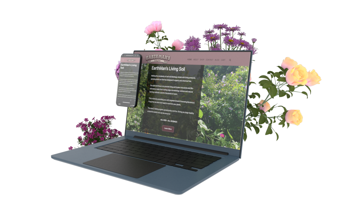
The redesign replaced the earlier, largely text-led presentation with a stronger branded masthead, a garden-led introduction and a more coordinated product experience.
Actual historical website footage: original site, followed by the redesigned site. A concise edit of the original comparison film.
The design had to survive the move into WordPress.
I used WordPress and WPBakery for the site, adding custom HTML, CSS and JavaScript where the default components did not give me enough control. The carousel was a particular challenge: changes to layout and behavior needed to be checked together across desktop and mobile.
I also built a set of custom cards and a reusable button treatment. AI supported the coding workflow, while I broke problems into smaller steps, evaluated the result and iterated on the implementation.
04 / A CONNECTED PAGE SYSTEM
From the first impression to the next action.
The homepage brings the identity, products and supporting content into the same visual language. The product labels carry recognition from the physical packaging into the catalog; the lower-page cards introduce the business and its content.
05 / CONTENT, DISCOVERY & DELIVERY
The work behind the visible design.
I worked on page metadata, readable URLs, content headings and image descriptions, using “organic living soil” as a focus phrase. These details were part of delivering the site alongside its visual identity.
The completed work connected branding, packaging and an implemented website. Refining the page structure and descriptions helped carry the same care from the visual presentation into the site’s content.
WHAT I TOOK FORWARD
Designing the whole experience means following through.
This project asked me to move repeatedly between visual design, client feedback and implementation constraints. The important work was keeping those decisions connected: the brand established the character, the prototype made it discussable and the code made it usable as a website.
It also strengthened my habit of working through implementation problems one at a time, rather than treating a polished mockup as the end of the project.